


Land and Light – Residential Projects
Residential projects
Rose Residence, 2005, 3500 s.f.
1-2. No structure could ever add to the extraordinary parcel the Rose residence occupies, architecture cannot upstage the Monarch cliffs, the Cabinet mountains or the glacial drama of Lake Pend Oreille. The house has front-row seats to the slow play of geology.
The design is influenced by the California shingle-style of Greene&Greene. The best known example is perhaps the Gambol house in Pasadena. This was a very appropriate direction for the project – the dormers, oversized windows and outdoor spaces all help bring the outdoors into the home. The placement of the Rose home could not be better suited for such an emphasis.
The bedrooms, baths, and offices are in the two floors above the garage. The main level sits separately, six feet above the garage slab. This allows the roof of the main level to drop out of the views from the upper floor. The north wall of the garage is sunk into the slope, allowing the direct access out from the floor above. Views of the lake bring the natural drama into all rooms except baths and closets.
The kitchen design was important to both clients, and this was one of the times I’ve been able to learn through the interests of the people I design for. I drew the sink as part of the kitchen island so that the view could be seen while washing dishes. Sandy asked that it be placed elsewhere so that the island would be a better workspace. It took Ken and I a while to come round. I design most kitchens this way now, giving the view to the cutting/working area rather than the sink, and Ken is happy to report, as he dices vegetables for another fine meal, unexpected satisfaction with the set up.
Ken has done a remarkable job with the landscaping, creating a zen tone to my eye, in the way he has highlighted the details of nature. Over the years he has blended the comfortable lushness of a backyard garden with the drama of the house’s high perch to create a small personal paradise.
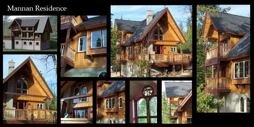
3. Mannan Residence
The Mannans had their first child on the way as they designed and built their home. As realtors, they had just come through the 2008 housing crisis. Hill swung the hammer as much as anyone on the crew and did the finish work himself, turning effort and optimism into a survival skill.
There is a hint of a myth to the house, with its high walls, steep roof and prominent chimney. I think it looks like a hunting lodge, for medieval Welsh heroes like Finn McCoughal and his dogs Bran and Killan.
Hill is a creative person (and a good realtor), his wife is a writer. Even on a strict budget, they allowed a small part of their dreams to show in the design.
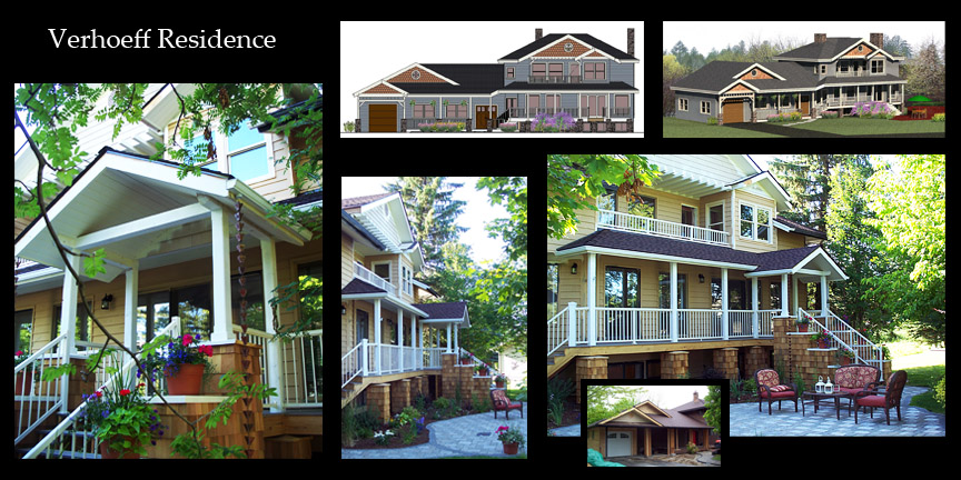
4. Verhoeff remodel
This is the only remodel shown, I include it because the change was very striking. Originally the house was Pacific-rim in style, with the sense of respectful understatement and privacy that is so important in many Asian cultures. The Verhoeff’s are exuberant and gregarious and wished to greet their guests with the bright friendliness of American tradition.
The tall front steps on this home allow for a basement level. We left the risers open so that light could reach the basement bedrooms.
Front steps and porches are inviting, inbound and out. They give visitors a comfortable place to stand when they knock on the door, they also help make the journey outside more comfortable for people in socks. The front-door,the change between public and private, inside and out, is perhaps the most important transition in home design. The attitude it expresses is the tone the inhabitants express to the world and themselves. I believe this home now looks almost as friendly as its owners.
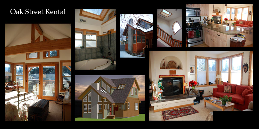
Oak Street Rental
built 2005, 1350 sf
I built this home for myself in 2005 before moving up to Baldy Mountain. I include it to show my own personal design tastes (the furniture and decorations in the photographs are not my own). I greatly enjoyed living the house though I am prefer to be out of town. There are those who move on if they can see the smoke from their neighbor’s chimney, I’m fine with seeing chimney smoke rising from behind the trees but that’s about the right distance. I rent the Oak street house out, it never takes long to fill.
In order to get both light and in-town privacy I made the windows tall, covering the lower half with thin curtains. This is is a traditional solution that is also common in Europe. I also put in skylights, for much the same reason.
The house was very inexpensive to frame because it is narrow so the roof and floor spans are relatively short. The efficiencies of the design meant I could add a few luxuries – a gas fireplace, jacuzzi tub, radiant floor heat, granite counters. A good lifestyle is the primary goal of architecture.
Ketchum, Built 2006, 3000 sf
The Sun Valley house is another project by Bruce and Heather, owners of Talus Rock Resort. It is in downtown Ketchum near the library. Bruce’s goal was to use the lot to its fullest potential, making use of all available space on a very small lot in a very pricey town. The roof-line is almost a direct copy of the code limitations, which I modified slightly to give it the feel of a modern European town-house.
The house is constructed with SIPS panels, foam insulation glued between sheets of plywood (or OSB). This was cost efficient for the roof but after the extra utility work the cost of the walls was more expensive than standard construction.
Whiskey Jack, built 2004, 3000 sf
The Whiskey Jack house sits in the the ‘Cottages’ development on the lake in Kootenai. It was built as a spec home by Minglewood Construction.
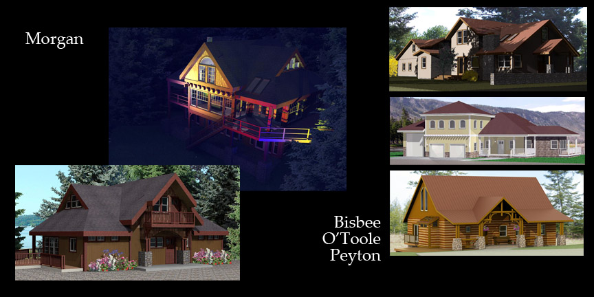
7. Morgan, Bisbee, O’Toole, Peyton
The Morgan home is on Priest Lake. Bud Morgan put a lot of effort into the home and kept the costs down considerably through creative management. He was able to purchase a set of high quality windows from a project that was never built, and so we designed the house around the windows.
The Bisbee project is on Oak and Ella, near my Oak Street house.
I do not believe the O’Toole house has been built but I’ve always appreciated the neo-classical design.
The Peyton project was an addition and remodel to a log cabin, with special emphasis on the front porch.
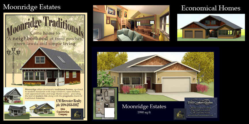
Moonridge Estates
Economical living is the way of life for most of us. A home should not get in the way of a balanced budget. I began my career with a strong interest in small houses and though my horizons have expanded this remains a core interest. In a way, for an architect to be able to design a small house is like a like a linguist knowing Latin, almost all further complexities have their roots in the Roman.
I like the discipline of designing efficient houses, every beam and nail must hold its weight, every window must celebrate its placement and its time of day.
The Moonridge Estates form a cul-de-sac off of Boyer Avenue just south of the Sandpoint airport. The lots are small and comfortably priced. The development is convenient to town and has a pleasant view of the McKinnick ridge. I’m glad the lots are small, much of the charm of town life is being able to walk or bike to destinations and that requires an efficient use of land.
Even on a budget, places can be shaped well. Vaulted ceilings and high windows can add to the sense of spaciousness, as can easy access to outside. Size perception is relative, as long as a room is large enough to function, it can be designed to feel large enough as well, with light and color.
residential-architecture